Thursday, January 3, 2019

#4 - The Game Engine


I said last time that I’m not an illustrator. I’m even less of a game designer. I had Mario Maker for maybe a week before I got frustrated. So, at the beginning of the project, I knew that I wanted this to be dating simulator without dating meets pokemon without the pokemon. Simple premise, I think. But I had no idea how to make it happen.

So I took to google. 

Already I was familiar with Lemmasoft Forums, a popular place for visual novel-esque creators to talk about projects. (I’d been on the site shopping for freelance writing gigs.) I also knew of this existence of game editors like RPG maker, Game Maker, etc. What I didn’t know was the exact format of the game. Was it an RPG with heavy visual novel elements or a visual novel with heavy RPG elements?

First thing I did was expand my knowledge base, hoping that along the way I’d pick up a few ideas as to how to focus the game a little more. Knowing from the outset that I was interested in blending genres, I looked for softwares with more robust capabilities, and to do that I looked at genre-blending indie games with interesting mechanics. I did so because inventive mechanics demand flexibility in their engines.

Here’s what I found. 
Monster Prom: Unity
Doki Doki Literature Club: Ren’py
Undertale: Game Maker
The Stanley Parable: Source
Oxenfree: Unity
OneShot: RPG Maker
Night in the Woods: Unity

I know what you’re thinking. Unity seems like the way to go. 

HAHAHAHAHAHAHAH ARE YOU DUCKING KIDDING ME MATE HAVE YOU SEEN IT? If I even dare to download the personal license it’s going to take me out behind the 7-11 and beat the ever loving oopsy poopsy out of me.

Image result for Unity
This is Unity. Eat your heart out. 

Luckily, there are other options. I initially considered using RPG Maker because, while the narrative element might have suffered as a result, it would have been a lot easier to get the battle system figured out and I wouldn’t need to learn how to code. Bonus points to the fact that in RPG maker I was going to be able to put in areas that the player could walk around, adding to the game feel. It all seemed pretty clear cut at the time since, in my head, the project still looked more like Pokemon then it did Hatoful Boyfriend.

There was a pretty sick deal on Steam so I was able to download MV for like $0.05. Digging into the software, however, it became quickly apparent it wasn’t going to work. I still wasn’t sure if I was going to release Socializing Simulator for free or for profit (more on that in a later post), and if I wanted to release it for profit it was going to cost a lot to get enough assets to make it not look like an RPG Maker game. More importantly than that, it was at this point that I realized that I needed to lean more into a visual novel format than an RPG, because the writing was going to be the main pull of the game. Even in the battle segments, the writing was really going to be the thing that sold it.

Ren’py was next on my list because, well, Doki Doki. And, also, free.

Ren’py scared me a bit at first, because while you had to learn a very simplistic version of coding, it was still coding. It’s a thing that smart people do. I am not smart people. Fortunately, I know smart people. I mentioned to one of my buddies, who breathes code for a living, that I was looking into learning some basic python so that I could understand Ren’py better. He gave me a couple of books and helped me work through a few ideas about the game play and how to flesh it out.
So I gave it a shot. It stuck.

On day one it took me five hours to figure out how menus work and now, six months later, I’ve pretty much finished the story segments of the battle system and laid down the ground work for a battle system. It’s still SUPER rough, but it’s serviceable. Something to build off of at the very least.

Coding is like a weird, addicting, puzzle that ends up being oddly satisfying when you figure it out. And Ren’py is actually a great program to get your feet wet and start training yourself to work in that mindset. But, also, there’s no shame in using a game editor too.

That’s all I got for now.


P.S. I lied about the comics.
Share:

Saturday, December 8, 2018

#3 - Character Art & How to Communicate with It


The art. Right. 

travis willingham hands GIF by Geek & Sundry

Let’s talk about it. 

So, it merits saying, I’m not an illustrator. I doodle, that’s the extent of it. And I feel like I can put something together that will serve enough of a purpose for the game. However, the art will probably be one of the weakest points. But I feel like that’s okay?

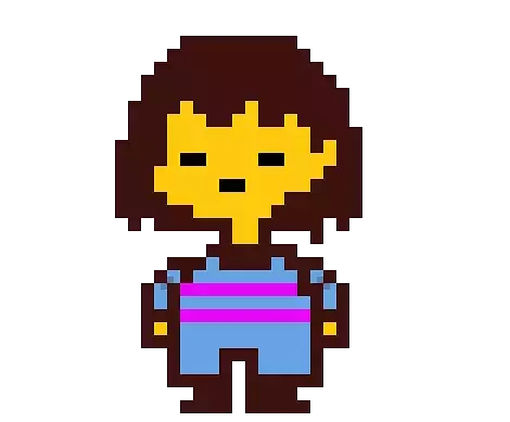
In my experience as a game player (thinking in terms of a consumer rather then a creator), art has always been something I’m willing to bend on. I’m specifically thinking of Undertale here because, unpopular opinion, I don’t think most of the art in Undertale was good in a traditional sense. Did it serve it’s purpose? Yes, to a inspired extent. And there are moments where the art is stunning. Examples include openning pixel art, Asgore’s boss battle, Papyrus (yesPapyrusfightme). But for the majority of the game you’re walking around flirting with mothers as this blob.
Image result for frisk undertale
Sexy Mama Killer Right There. ;)
And there are moments that I feel Fox intentionally subdued the art in order to allow the storytelling and the game mechanics to take center stage. There were also times where the art was designed to be gross so as to get under your skin. It’s not a stretch to say that Photoshop Flowey looks like Fox was trying to use Photoshop for everything it wasn’t meant to be used for.

Image result for photoshop flowey
Photoshop Flowey

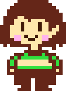
And there are moments where the simplistic art style is used to play more to the player’s imagination then it is to illustrate any sort of real horror. At the end of the genocide run, there’s no creepy hallway or Eldridge horror waiting for you. There’s only a blank screen, and a character that looks all to much like yours save for the fact that their eyes are open. Let’s focus on that bit for a moment. At the end of a playthrough of the game designed with the intention to make you suffer for your own wrong doing, the art that Fox chose to greet you with is a representation of you with your eyes open rather then closed. He wants to have an image of you to stare at you without blinking. To calmly talk to you about all of the atrocities that you’ve just committed. He put something like Photoshop Flowey in a game and still managed to make a blank screen with a child on it the most unsettling story beat. That worked so well because you weren’t distracted by the quality of that art, and so you were able to linger on what that art was communicating to you.

Related image
A Reflection of You

But I digress. 

The point I’m trying to make is that art in games doesn’t need to be good, it needs to be communicative. (This is the point where I become the 500th person on the Internet to recommend you read Understanding Comics by Scott McCloud, which explains this sentiment with eloquence.)

So I don’t feel so bad that Socializing Simulator won’t have art that rivals Doki Doki Literature Club or Monster Prom. If my art gets the point across, then cool. Gives me more opportunity to realize my own vision.

But I’d be lying if money wasn’t also a factor. Art is expensive and if I can get away with doing it myself, it’s something I feel like I ought to do. It helps that if I’m looking at it from a non-baised standpoint, my art style isn’t that far from what I would have sought out from a professional. I wanted to go with something more on the cartoonish side so that it could allow the player to easily relate to the protagonist and so that it could lean into the comedy. And I wanted to go with an anime-influenced style because it has a cultural pretext of lending itself to quick drastic tonal changes in a way western art typically doesn't.

Now that I’ve gone and mentioned it, I want to spend a moment on that. The flexibility of an art style.

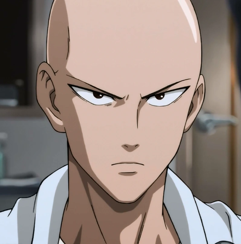
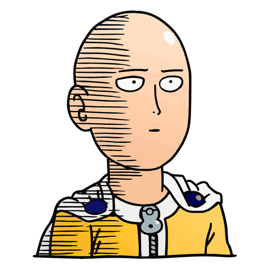
Image result for saitamaImage result for saitama

Anime has always appealed to me just by the flexibility the art style is allowed to take. You have jumps from the hyper realistic to the more basic and exaggerated happening in these comics without so much as batting an eye. Often times these jumps are used in order to signal a tonal shift from serious to silly. This has been used commonly enough to be considered a trope in the medium and tropes can be utilized to either inform in the situation in which they are used or to blatantly bring awareness to them.

I threw up some pictures of One Punch Man on this post because that show somehow does both at the same time, while adding some commentary on top like it’s a cherry on a sundae? There’s a lot to talk about how One Punch Man uses the trope of bouncing from serious to silly using the art style, but I think the thing that sticks out to me the most is how it used that trope in a way that I haven’t really seen done anywhere else. I’m talking specifically how it’s used with Saitama.

Simply put, what’s so interesting about the way Saitama is portrayed in the show is that when Saitama is depicted more simplistically, you get the sense that rather then that being an exaggeration, that’s his more true self. The more realistic, bold self is used to show a persona that he puts on and a goal he wants to achieve. The driving force behind the show is that Saitama wants to feel the spark of life and purpose the more realistically drawn version of himself portrays, but he can’t because things are too easy for him. This is a subtle inversion of this trope while being a brilliant satire and a powerful visual indicator of the very real dream that Saitama has.

Again, art being communicative, while not needing to be “good”.

But I’ve rambled long enough. I’m realizing now that these blogs are more discussions of craft then they are practical recordings of my progress with the game, so maybe next time I write a little more about how I tackled starting to put together the prototype? Sorry, between the intense fear of talking about anything having to do with my personal life and the giddy feeling I get when I think I sound smart, discussions about craft are par for the course.

Also, maybe comics soon?


Share:

Monday, November 12, 2018

#2 - The Writing + A Crash Course in Media Communication


So, the writing is the only part I had any experience with going into the project. To give some context, I write stuff. Lots of stuff. Story stuff, opinion stuff, silly stuff, most things in between. (You can see a short list of the things I've made public here.) So here's where I felt comfortable. The story.

I mentioned in my last post that this story needed to be told as a game, and that's mainly because of the way games tell stories. Now, I'm about to dive into an aspect of media consumption that most of us are, at the very least, subconsciously aware of. And that is that every medium brings with it a unique way for an audience to experience a story.

Think of the difference between  how you feel when you're reading a novel verses watching a movie. In the novel, you spend a lot more time digesting and thinking over the material you're reading. You're tasked with imagining the world, the characters, the textures, the sounds, all based off what the writer gives you to interpret. The writer is your guide through this tale, but by all rights you are the one that in charge of creating the experience. And since they already have you invested with the long haul, they can trust you to go with the flow. They don't need to adhere to the same three act structure as a movie might. They can spend time walking you through someone's entire life, or they can keep it to a brief moment.  They can give you little asides into a character's more mundane doings, or take you on a little philosophical walk. They can also place you right into multiple character's heads without it being too jarring.

Movies, however, give you more pieces of the puzzle. They provide visuals, sounds, pacing. They begin with a universally shared starting point, our perception of reality. Defining what we see and hear isn't something they need to worry about. However, without the established presence of the “story teller” walking you through every beat, the film makers and the audience must rely on that set of common expectations. Both parties enter the experience expecting for reality to work as reality tends too, so as to do away with the need to explain what reality is. The film makers rely on the fact that you don’t need a character’s voice explained to you because you can hear it for yourself. And count on that because they only have 90 minutes (give or take) to deliver an experience that books have the luxury of taking days to give. These expectations can be subverted in both mediums, but it often takes a great deal of time or a great deal of cleverness. Time is an element that books have in abundance while movies have then in scarcity.

Essentially, what you have is two different playgrounds. Both have a sandbox, but one has a swing and the other has a slide. The possibilities are endless for each, and there is a little overlap between the two, but you are still playing with a different set of equipment. You're not going to do everything with one that you can with the other. You can play games using just the sandbox, meaning you could play those games on either playground. But, more often then not, the best games to be played will specifically utilize their specific equipment (slide or swing).

So circling back, why a video game? Why do I need that specific equipment to tell this story? 

The best gaming stories are told by inviting the player into the experience, as opposed to other mediums where the audience is only invited to watch. Books can do this too, but with games it’s more necessity then it is happy accident. As such, games play more with empathy then with sympathy. That’s the aspect that I wanted to focus on when crafting the narrative of the game. I didn’t want my  audience to simply observe the main character, I wanted them to step into their shoes.

Yet, at the same time, I still wanted to keep the audience at a bit of a distance. As stated in my previous post, I wanted to create an entry point of sorts, something to allow a deeper understanding of what having anxiety is like but I also wanted to have fun with it. That’s why Socializing Simulator’s player character isn’t a silent protagonist a la Link (Legend of Zelda), Gordon Freeman (Half Life), or what have you. Instead, there’s a protagonist that has an established personality. This game isn’t asking you to be yourself in this world, it’s asking you to be someone else.

And, I promise, there’s good reason for that. 

But that’s a story for another day. Next post I’ll probably dig a little more into the art. I’ve also got some small comics in the works for your readin’ pleasure.

That’s next time. For now, happy holidays.


Share:

Tuesday, October 9, 2018

Devblog #1 - The Idea

One day I was hanging out with my younger brother and we were doing the usual. Talking about everything. Jobs. School. Art. Monster Prom had just come out and I was talking about how I was excited about the thought of a "multiplayer dating sim". Such a simple concept, yet so inspired when you really think about it. As a result, I happened to mention it would be funny it someone took a dating sim and turn it into a friendship simulator instead.

Now, six months later, there's a prototype demo.

How did it happen?

It happened like a lot of the stuff I create, a dumb joke never meant to go anywhere. (It's a lot like my life in that regard.) But then that joke made another joke, which made another one, which somewhere along the way became a script, which then inexplicably became something close to resembling a game.

And then it stopped being a joke.

Let me first explain, I am not a game dev. I enjoy games a great deal, I never thought I'd be making one. I was the one who played the levels in Mario Maker. I don't make games, I make stories. And this was quickly becoming a story near and dear to my heart.

It's a story about anxiety.

I didn't realize that until I finished the first draft of the script for the demo, but as a key component of the game is the stats you gain through the story segments, and the most common stat you gain is the anxiety stat, it pops up every three sentences. And it started off as just a running gag, but then I realized it kinda wasn't? Because that's what it's really like, at least for me. I analyze everything. I am nervous about everything. And I never stop thinking about what I could have done better for even the small things, like eye contact or shaking someone's hand.

More than that, I was frustrated that no else seemed to understand what that was like.

This game is my answer to that frustration.

I want to show people what, in my experience, having anxiety is like. And I want to do it in a way that's easy to swallow. This game is funny as long as you want it to be, partly because I think a lot of anxiety hides in humor (sneak son-of-a-gun) and partly because I think that laughter is one of the best bridges to understanding. One that can easily to mess up, sure. But when done well, powerful.

There's the ethos. Let's laugh about anxiety.

As for this, the dev blog. As I mentioned, this is my first crack at game development of any kind, so I thought it'd warrant jotting down the journey, if for nothing else then so that others can avoid my mistakes. I might come back to the topic of story inspiration if it's worth saying, but I mostly want to focus on how I figured out how to make the d*ng thing. Next blogs few blogs will be about writing the script, laying down the outline, and researching game engines.

'Til then, peace.

Share: